This type specimen book showcasing Positype Foundry's Akagi Pro was created as part of my coursework. The following is an excerpt from the design rationale submitted along with this assignment:
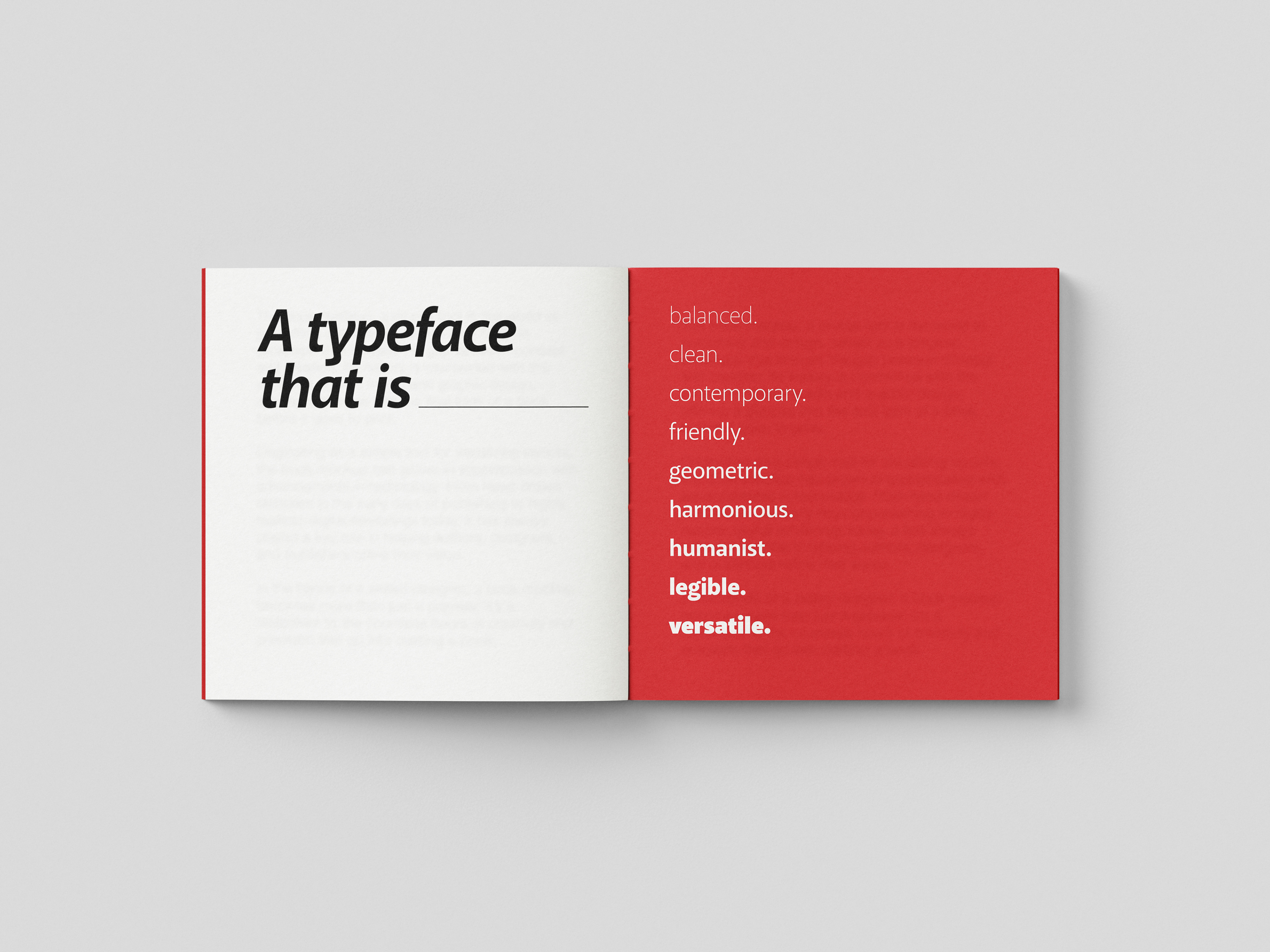
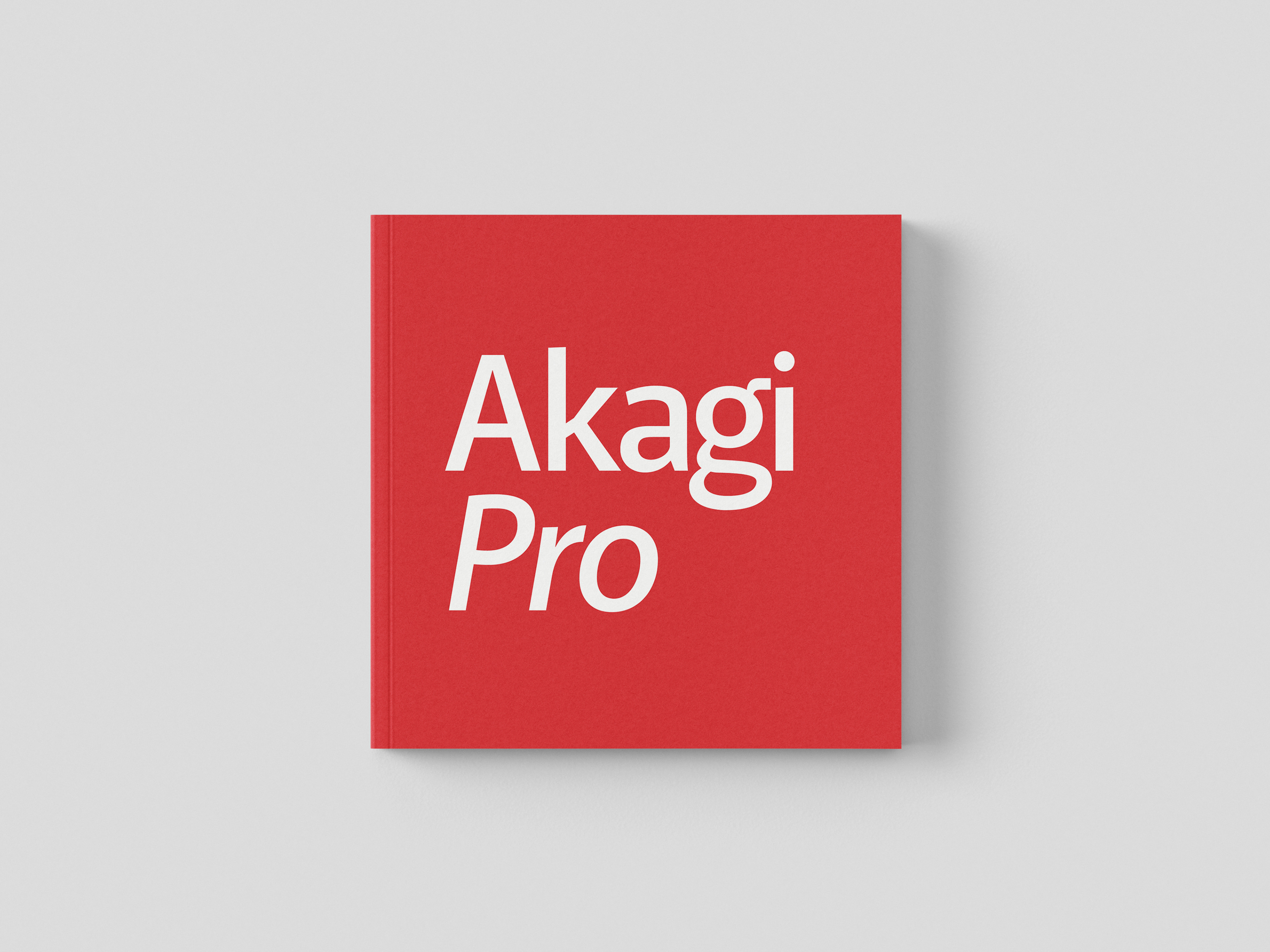
I decided to take a similar stylistic approach to my specimen book as my poster by employing a minimal design which is evocative of the essence of Akagi Pro as a typeface and by additionally using the same colour palette—red and white which represent the Japanese flag along with black. By doing this, I hoped to maintain a consistent design language between the two projects.
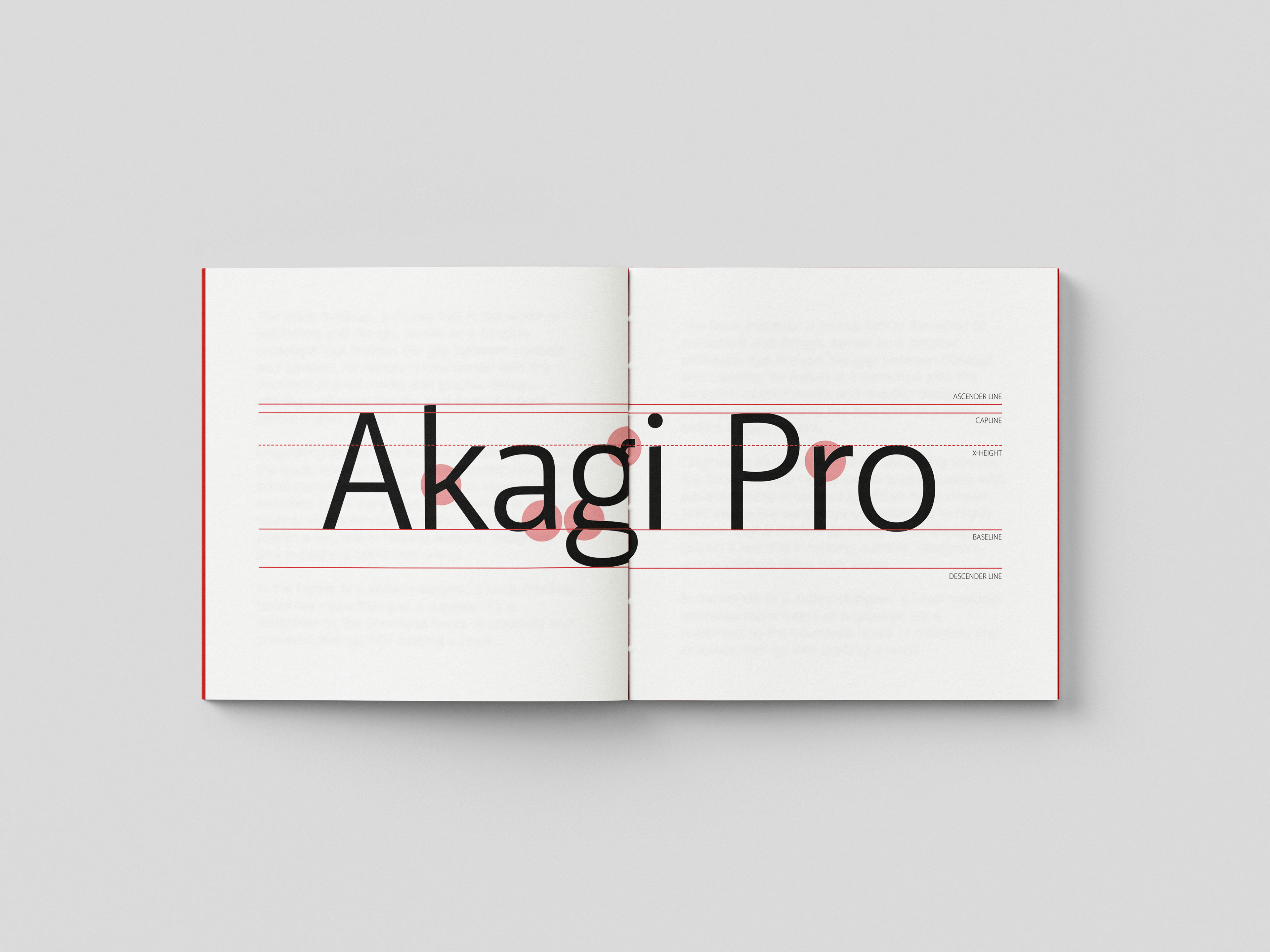
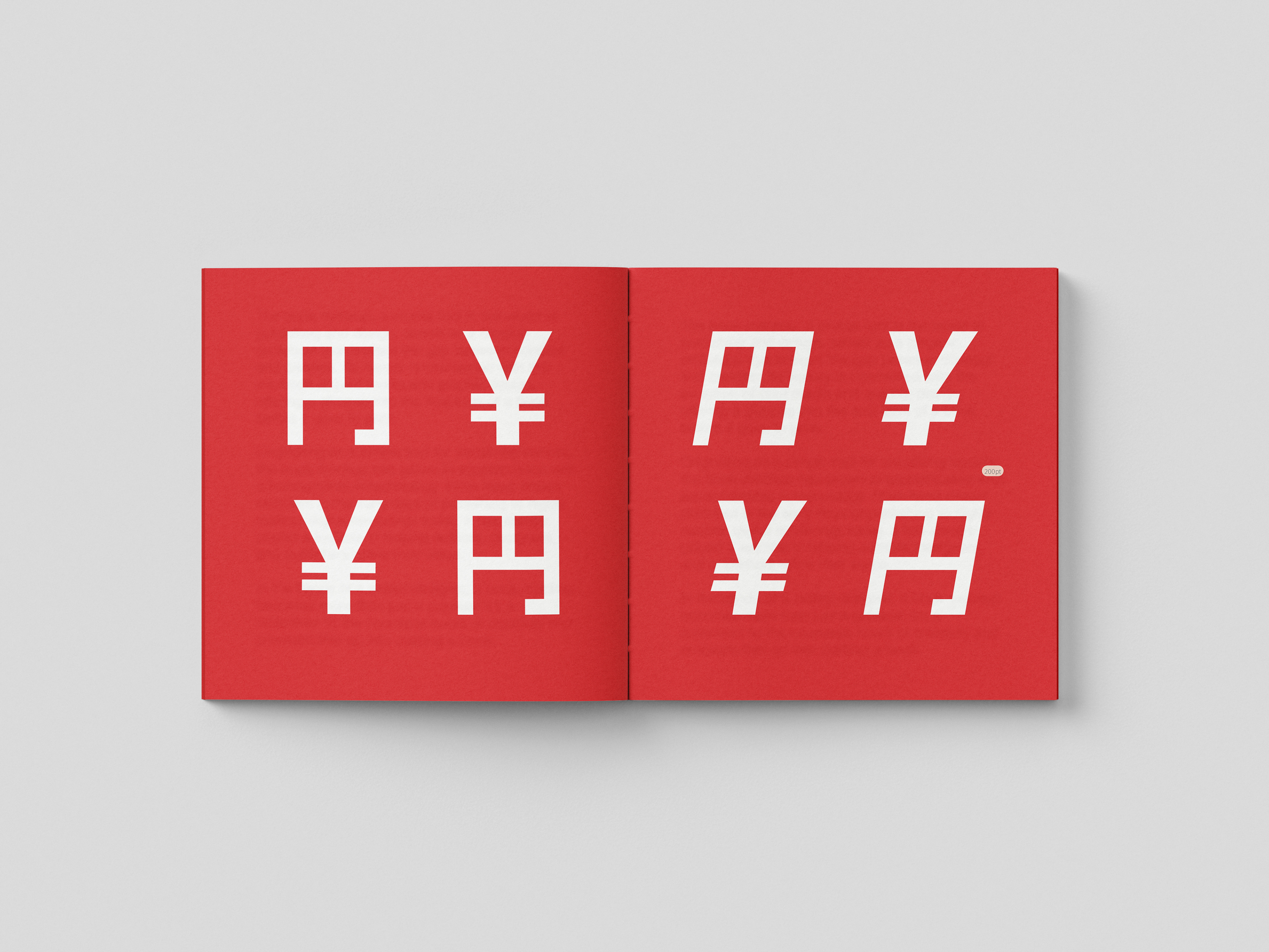
When considering the format of my type specimen book, I decided to make a square booklet as a way of subtly paying homage to one of the inspirations of the font, the characters of the Japanese language. This is because these characters fit perfectly within the proportions of a square. However, rather than setting even margins right in the centre of the page, I chose to reference the work of Hochuli and Kinross when defining the margins in order to give a balanced appearance to the layout. Much like the typeface itself, this was intended as a blend between Japanese and Western aesthetics.